Expandable HTML & CSS Coding
The importance of writing expandable modules of code is commonly over looked. Since most of us have good eye sight it makes sense that graphics and text for most designs are optimised for the average visitor. But what happens when a customer with impaired vision views your website and uses their browser's zoom tool so that they can actually see and read the page... Do parts of the page become hidden and text unreadable or does the page adapt and remain usable?
Browser behaviour is quite simple... There are two ways that browsers zoom a web page:
- Zoom the entire page, which is unlikely to cause any problems. The whole page is treated like an image with everything scaled together.
- Increase only the font size of the page, which is highly likely to make the page unusable if it has not been designed with expandable containers.
Testing your code is very simple, but not a browser feature that is commonly used (since most of us have good eye sight). So lets have a look at how to implement these two zooming methods using Mozilla Firefox.
The "Zoom Text Only" setting controls whether the entire page is zoomed or just the font size is increased.
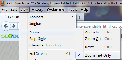
The keyboard short cuts are worth noting, as they make things a lot easier.
Coding For Increased Font Size
Increased font size needs a bigger container, which means you need to ask the question: "When the font size of a particular page element gets bigger... Should the container increase in height or width or both?"
Single line text containers, as a general rule, will need both increased height and width.
Multiple line text containers, as a general rule, will need increased height only. The fact that the text has been wrapped to a new line usually means that the design's maximum container width has already been reached.
The big question that should be constantly asked is: "How should each text container expand with increased font size?"
Some coding examples will now be worked through and explained to help clarify some of the different coding methods...
Example 1
The fist example is for the phone number container... Below is a screen shot of how things look at normal font size.

The above screen shot shows the design rendered exactly how the graphic designer had intended. But what happens when we increase font size?
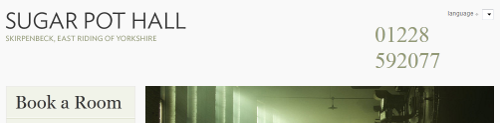
The increased font size has caused the second part of the phone number to drop onto a second line. Although increasing the font size is never going to look particularly nice, we should always test what happens and ask: "Is this the best way for each page element to behave?"... And I think that most people would agree the phone number in this example does not. There is plenty of unused space to the left of the phone number and a much more pleasing look would be for the phone number to expand in width and remain all on the same line.
So we have decided that the phone number should expand to the left and remain on a single line. But why is it dropping to a second line in the first place?
The problem will most likely need to be resolved by re-coding some of the CSS. So lets consider what is actually happening with an overview of the code and how the browser renders it...
The phone number and it's container have been coded in the following way:
- The phone number's container has been positioned so that it's right hand edge is nicely aligned with the edge of the page container. (No problems here, this is good practice)
- The phone number's container has also been set to left align the text inside of it. (Things are starting to go wrong)
- Because the text is left aligned, the width of the phone number's container now defines where the phone number will start (This is not a good situation, because what actually needs to be set is the last digits alignment on the page)
- The width of the phone number's container is carefully set to a fixed value so that the last number is nicely aligned with the right edge of the page. (This container can now only expand in height)
A visually impaired visitor now views the site and...
- The font size is increased...
- The phone number will no longer fit inside the width of it's container...
- The container MUST expand...
- The containers width is fixed, so it can only increase in height and must wrap the text at the space.
Fixing this problem is quite simple. At step two in the above code overview, the phone number's container should be set to right align the text inside of it. This in turn means that the container's width does not need to be fixed for the last number to align with the right edge of the page... Hence the phone numbers container will now expand in width when font size is increased.
Example 2
The second example is for an image/text container... Below is a screen shot of how things look at normal font size.

The above screen shot shows the design rendered exactly how the graphic designer had intended. But what happens when we increase font size?

Example 3
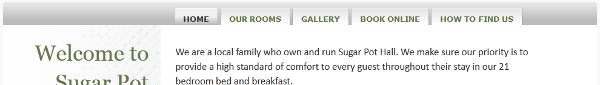
The third example is for a navigation container... Below is a screen shot of how things look at normal font size.

The above screen shot shows the design rendered exactly how the graphic designer had intended. But what happens when we increase font size?


